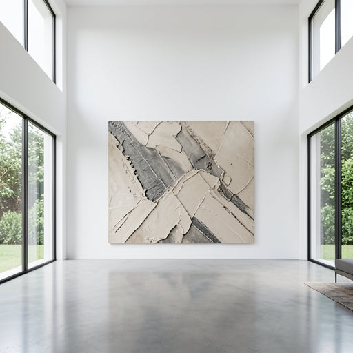

Neutrals are the ultimate expression of luxury.
Specifically, shades of beige, tan, and cream form the foundation of the "Quiet Luxury" aesthetic. At LargeWallart, we specialize in creating pieces that don't just fill a wall-They define the texture of the entire space.
The Timeless Appeal of a Neutral Palette
Why do top designers keep coming back to beige and tan? Because these colors allow the mind to rest. In an over-stimulated world, a home filled with earthy, neutral tones becomes a sanctuary.
But the secret to making a neutral room feel expensive rather than empty is depth. This is achieved through the use of sophisticated . When you use a single color but vary the physical height and shadow of the paint, you create a visual rhythm that draws the eye in without overwhelming it.
Why Texture is the "Secret Sauce" of Neutral Art
If you have a beige wall and hang a flat beige print, it disappears. But if you hang a handmade textured painting, the art stands out through the play of light. The physical ridges ensure that even the most minimalist palette has "weight" and presence.

Styling Your Space with Neutral Tones
One of the biggest advantages of is its versatility. You can easily pair a tan painting with furniture or wooden accents to create a layered, multi-dimensional look.
To master this style, focus on the "Tactile Contrast." Pair your smooth linen sofa with a textured abstract canvas. This contrast between the smooth fabric and the rugged paint ridges is what creates that coveted "designer look."
FAQ: Mastering the Neutral Look
1. Will a beige painting look too "washed out" on a white wall?
Not if it has physical texture. The shadows cast by the 3D ridges of the paint provide the necessary contrast to make the artwork "pop" against a light-colored background.
2. Can I mix different shades of tan and cream?
Absolutely. In fact, mixing "warm" beiges with "cool" tans is the key to a professional, curated look. It prevents the room from looking like a showroom and makes it feel like a collected home.
3. What room is best for neutral large art?
While neutrals work everywhere, they are particularly effective in living rooms and bedrooms where a calm, serene atmosphere is prioritized.
Conclusion: Elevate Your Home with Quiet Luxury
Choosing neutral wall art